Every year, The Pantone Colour Institute collaborates with the New York Fashion week organisers to predict colour trends for the seasons ahead.
 They collect data from all the different catwalk shows, analyse it and release their colour predictions to the media.
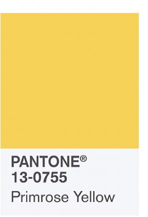
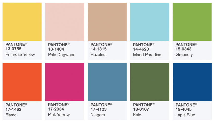
This year, they’ve tipped Primrose Yellow as one of 10 colours to watch this spring.
The colour experts say Primrose Yellow “sparkles with heat and vitality. Inviting us into its instant warmth, this joyful yellow shade takes us to a destination marked by enthusiasm, good cheer and sunny days.”
I don’t know about you, but after this long, dreary winter, I’m ready for some heat, vitality, cheer and warmth. If you’d like to use Primrose Yellow in your home decor this year, here’s some inspiration:
Using Primrose Yellow in your home decor – 6 inspiring ideas –
1) Grey and yellow:
Grey and yellow are a winning combination! Use the sunshine hue to add a splash of colour to any room. Primrose Yellow accessories (such as lamps, blinds and scatter cushions) will brighten up an otherwise neutral palette.
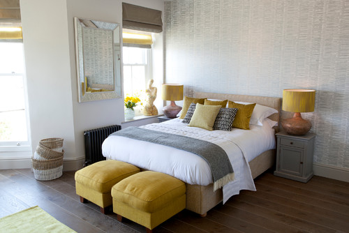
Top tip: When shopping for grey paint, look for shades with warm undertones. This will stop the room feeling cold, harsh and industrial.
2) Yellow on yellow
In the following photo, Todd Remington (an architectural firm from Colorado in the United States) painted the room yellow, from ceiling to floor. (Yes, we know this is a paler shade, but the same tips will apply to Primrose Yellow too!) The company also decorated the room with yellow accessories (note the artwork, bedding, photo frame and chair cushion). On paper, this sounds like a terrible idea. Yet look at the photograph below, it doesn’t feel overwhelming at all:
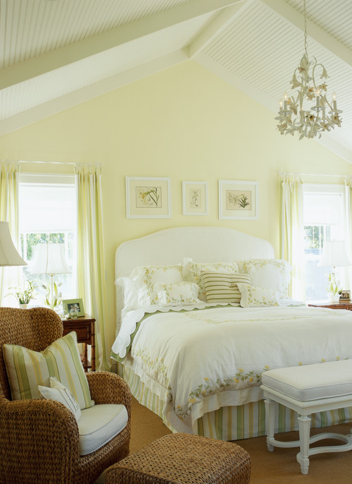
On the contrary, the room feels light, fresh and clean. This is because Remington has punctuated the yellow room with white and wicker furniture.
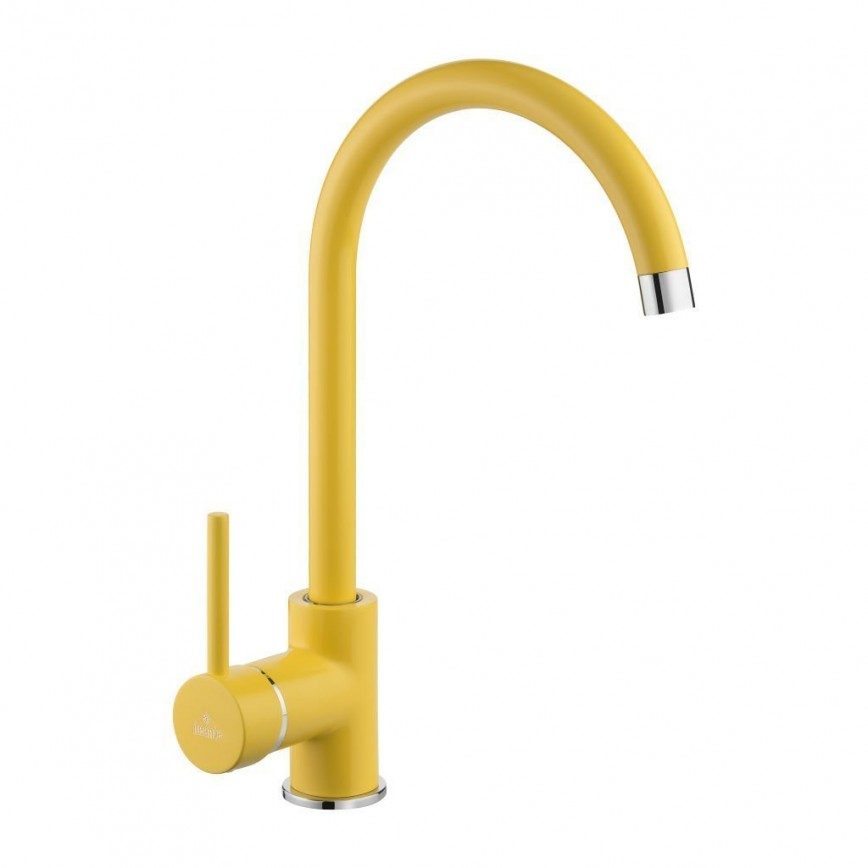
3) Trendy taps:
Add a little cheer into your kitchen by installing one of these trendy taps from Millie. The company manufacture sink mixer taps in a range of fashionable colours, available on Amazon:
4) Brighten up your bathroom:
Use shades of Primrose Yellow to soften up an otherwise clinical-looking bathroom. Brighten up your bathroom by using yellow ceramic tiles, or by painting the wall yellow. We love how the interior designer has used coordinating yellow grout in between the white subway tiles in the photo below:
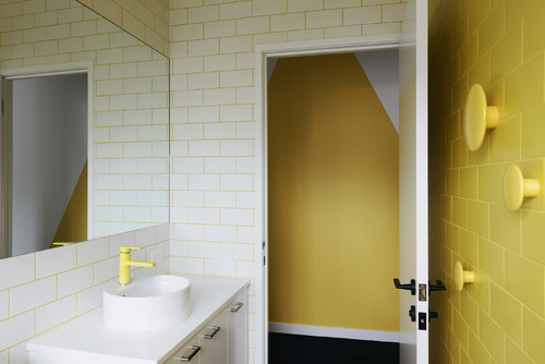
Top tip: Did you know you can buy specialist grout dyes to achieve the above effect?
5) Pair Primrose Yellow with a pop of pink:
Pantone also chose Pink Yarrow as one of their colours to watch this season. According to the colour experts, Pink Yarrow is tropical, festive, whimsical, lively, captivating and stimulating. It’s a “hue that tempts and tantalizes.” They call it bold, attention getting and tempestuous.
Feeling fearless? Pair both bold, bright shades together. Cave Interiors show us how it’s done in the photo below:
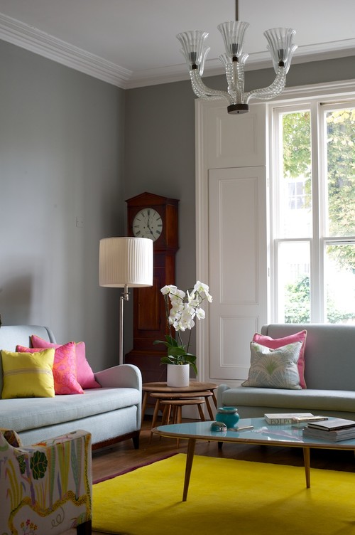
We love how they’ve paired the colours with dark grey for a fresh and modern look.
6) Add a dash of spring colour to your dining room:
Transform your dining room with chairs painted in contemporary modern colours. Simply pair them with a white table for an easy, fresh look.
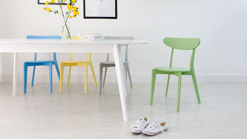
In the photo above, you’ll notice the primrose yellow chair is paired with aqua blue and leafy green – two other shades Pantone have highlighted for spring 2017.
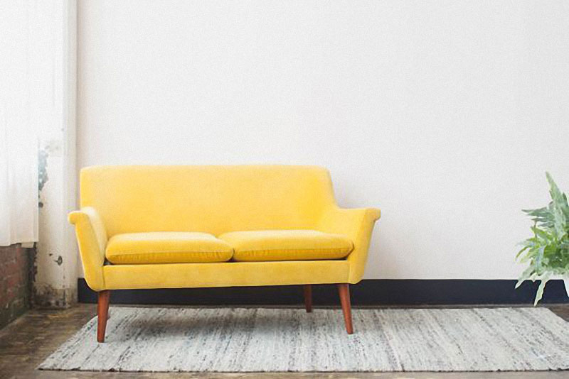
Featured image via papernstitchblog.com. All other images via Houzz.co.uk, unless otherwise noted.